Rome Didn't Fall in A Day.


Objective Truth Exists and is Accessible to Everyone.

All Human Problems can be Solved with Enough Knowledge, Wealth, Social Cooperation and Time.


Photo: Rusty Peak, Anchorage, Alaska


Translate

Thursday, November 10, 2011

Peak Oil


Peak Oil is a concept proposed by geologist M. King Hubbert, in a paper written in 1956.   In that paper, he famously predicted the peak of US oil production, which strikingly occurred as predicted fourteen years later   (figure 1).   

Figure 1.  Hubbert’s amazing prediction!

The concept of Peak Oil is highly contentious.  A number of smart people claim that a critical economic resource will soon decline, and other smart people claim that there are no limits to growing oil production.

Among the Peak Oil advocates are Colin Campbell and Jean Laherrere, authors of “The End of Cheap Oil”, Scientific American, 1998; Matthew Simmons (RIP, 2010), author of Twilight in the Desert; Ken Deffeyes, professor emeritus at Princeton; participants in the on-line forum “The Oil Drum”; and a group of distinguished geologists and engineers who formed the Association for the Study of Peak Oil.   

On the other side of the debate, smart people argue that Peak Oil will not occur for many years.   This group includes the highly regarded BP Statistical Review of World Energy; the International Energy Agency;  Daniel Yergin and the Cambridge Energy Research Associates (CERA), economic advisors to the Saudi government and many major oil companies.   Daniel Yergin is the Pulizer-winning author of The Prize and The Quest, and head of the CERA.   In the view of this group, new production from natural gas liquids, tar-sands,  the Mid-East, the Caspian region and Brazil will more than offset the natural decline of existing production.

Hubbert predicted global peak oil in the year 2000.   We are now eleven years past that date, and production is still growing.   So, who is right?  Is Peak Oil around the corner?   How did Hubbert make his predictions, and will he be right again?
Figure 2.  Hubbert predicted global peak oil about the year 2000.

Hubbert’s Peak
Hubbert’s original idea is ingeniously simple.   We have to find oil before we produce it, and we usually have a pretty good idea of how much we found several decades before that oil is produced.  The rate of production is assumed to be a bell-shaped curve, so the half-way point, when half of the reserves have been produced, is peak production.

Geologists find most of the oil in early exploration, because the largest fields are easiest to find.   After the largest fields are discovered, there is a predictable decline in field sizes.  The graphical display of the decline is sometimes called “the creaming curve”.   As geologists explore the globe, they proceed from the easiest areas to more difficult areas, leaving remote and difficult areas for last.  So if we look at the peak of discovered oil and make some assumptions about the decline of new discoveries, we can forecast the production peak.

United States’ Peak Oil
Let’s look at US oil discoveries and production as a case history.
We can only produce as much oil as we have found.   About 200 billion barrels have been discovered in the United States to date.   This is the area under the discovery curve (figure 3).   We can see that US discoveries peaked in the 1930’s, and declined thereafter.   
Figure 3.  US Oil Discoveries, 1900 – 2008.

And so far, we have produced 181 billion barrels (Laherrere and Tverberg).  The number is somewhat larger if natural gas liquids are included.  This is the area under the production curve (figure 4).   Remaining proved reserves are about 21 billion barrels (Wikipedia, Oil Reserves in the United States).   Production peaked in 1970 and declined in turn, exactly as Hubbert predicted in 1956.

Figure 4.  US Oil Discoveries and Production.   Production volumes must follow discovery volumes.

Since oil must be discovered before it is produced, it follows that the shape and size of the oil discovery graph must be reflected in the subsequent graph of oil production.   The area under the production curve has to match the area under the discovery curve (figure 5).
Figure 5.   US Oil Discoveries and Production; areas under the curves must ultimately match. 

Hubbert took the volume of known oil discoveries and estimated the total volume of oil that would eventually be discovered.   He then made a bell curve that fit the history of production, and fit the total volume of oil under the curve.   Hubbert assumed that the peak would be symmetrical; i.e., that Peak Oil would occur when we have produced one-half of the discovered oil.    Hubbert tried two models: one with 150 billion barrels of ultimate reserves, and another with 200 billion barrels of ultimate reserves.    By 1970, we had produced 94 billion barrels, very close to one-half of our original reserves endowment.  And that was the production peak, about 40 years following the exploration peak.

Global Peak Oil

So, then we move from US history to the global picture.   Hubbert was able to predict the peak of US oil production, because data on discovered oil volumes were well-defined and accurate.   The problem in predicting global peak oil is that data for discovered oil volumes are not well known, distorted by various national policies related to OPEC production quotas and national security interests.    Nevertheless, it is well known that global oil discoveries peaked in the mid-1960’s.  

Figure 6.   Global Oil Discoveries peaked in the 1960's.  Data courtesy of Colin Cambell.

The sum of global oil discoveries through 2005 is about 1500 billion barrels (data from C. Campbell).  However, it seems likely that if the global oil endowment was only 1500 billion barrels, oil production would have already peaked.  The USGS has estimated the global endowment of conventional oil as a range between 2250 billion barrels and 3900 billion barrels, with a mean of 3000 billion barrels.  

Global oil production is now over 86 million barrels per day, or about 32 billion barrels per year.    Cumulative global production through 2010 is about 1285 billion barrels.  If the USGS mean estimate of global oil of 3000 billion barrels is correct, we will reach cumulative the half-way point of 1500 billion barrels in 2016, and can expect to see peak conventional oil.   If the high estimate of 3900 billion barrels is correct, peak oil will occur about 2026, keeping in mind that the USGS places only a 5% probability on the high-side resource estimate.

Figure 7.  Global oil production is still rising in 2010 (BP Statistical Energy Review).

Problems with Peak Oil Theory
    Critics say Hubbert’s method fails to take into account discoveries in new areas, unconventional sources, or applications of new technology.   Newer thinking about peak oil modifies Hubbert’s model with consideration of unconventional resources, new technology, economic substitution, arctic resources, and geopolitical considerations.   

US Gas Production History
US gas production provides a dramatic example of how production decline can be reversed through new technology and unconventional resources.  US natural gas production also peaked about 1970, in agreement with Hubbert’s prediction, but new sources of gas resulted in an extended plateau, rather than a decline from the peak.   Although conventional gas production peaked in 1970, exactly as Hubbert predicted, gas in unconventional reservoirs (coal and shale) became commercial through the application of horizontal drilling and hydro-fracturing technology.  The new supply rejuvenated US gas production, and produced a production plateau, rather than a peak.  Gas prices, which spiked to about $12 per thousand cubic feet in 2008, declined and stabilized at about $4 per thousand cubic feet as a result of the new supply.
Figure 8.   US Conventional gas peaked about 1970, as Hubbert predicted.


Figure 9.   Gas production from unconventional reservoirs has sustained total gas production on a plateau, rather than declining as expected in Hubbert's theory.

Per Capita Oil Production
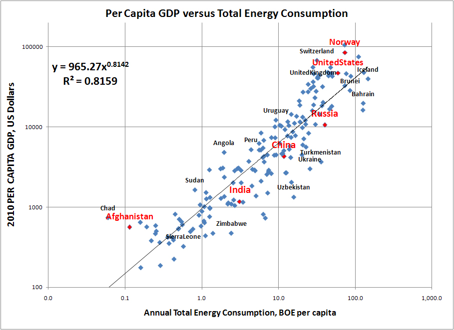
But from a self-centered viewpoint, the question is not how much oil exists in the world, but how much there is for me to put in my car.  And proportionally for every other person on earth.   World economic data show, without exception, that per capita energy and oil consumption is proportional to economic productivity.   Reduction of oil consumption per capita would cause higher prices and economic disruption until global economies adjusted to a higher level of conservation.

Although there is great uncertainty about the trend of future oil production, there is little uncertainty about future population growth.   Global population recently passed 7 billion, and will approach 9 billion by 2035.   Let’s consider several production scenarios, and the oil available for per capita consumption.
Figure 10.  Global population will continue to grow.

The IEA (International Energy Agency adopted an optimistic scenario termed “New Policies” as their base scenario.   The scenario assumes 1.2% annual increases in oil production to the year 2035.   About 55 million barrels per day of production (of the total 96 million) is forecast to come from fields not yet discovered or not yet developed.   There is substantial risk in this forecast.  My experience in the petroleum industry suggests that such unqualified success in new production is unlikely to occur.   
Figure 11.  In the IEA "New Policies" forecasts, a large wedge (55 million bpd) of forecast production is expected to come from fields not yet discovered or not yet developed.  

Even if the optimistic result of the "New Policies" forecast is realized, per capita consumption will rise only slightly by 2035, a gain of about 7.5%.   
Figure 12.  The IEA "New Policies" forecast would permit growing per capita consumption through 2035.

A second scenario might be a production plateau, as suggested by Daniel Yergin and CERA.   Assuming a plateau beginning in 2010, the result would be a per capita decline of 21% by 2035. 
 Figure 13.   A production plateau would still result in declining per capita consumption.

An alternative scenario termed “450” is presented by IEA.  This would be a production forecast limited by policies to stabilize atmospheric CO2 concentrations at 450 ppm.  Under this scenario, production would peak about 2019, and per capita consumption would decline 26%.
Figure 14.  The IEA "435" forecast would result in a significant decline in per capita production.

A final scenario considers a symmetrical Hubbert Peak in 2015.   This scenario reflects the classic Hubbert theory, that production will peak and decline when we have produced one-half of the USGS mean estimate (3000 billion barrels) for the global oil endowment.  Global per capita production would decline 36% by 2035.   It is worth noting that the American share of per capita production can be expected to decline substantially more than the average, given economic growth in developing nations.
Figure 15.   A symmetrical Hubbert's Peak in 2015 would result in more than 35% reduction in per capita oil consumption.

Conclusions
I think it is likely that peak oil will occur before 2020, with a consequent rise in oil prices.   Although tar-sands, shale-oil, synthetic oil and other substitutions will moderate the decline, I think it is unlikely that the “Shale-gas Revolution” will be replicated in oil.  Oil has a much higher viscosity than gas, and is simply more difficult to extract from rock.  Any unconventional oil source will have a lower EROI (Energy Return on Investment*) than conventional oil, and will be developed more slowly, and at a higher cost.   New sources of conventional oil will also be more difficult and more costly than previous sources.   

As a policy recommendation, I think it is prudent to anticipate higher prices and reduced oil supply, for personal and national planning.


References
My Ideas


Various Peak Oil Sites

BP Statistical Energy Review
IEA
CERA

United States EIA; lots of good data

GSwindell; more good data

Global Population

IEA Documents
http://www.iea.org/weo/docs/weo2010/weo2010_london_nov9.pdf

Monday, October 24, 2011

On Progressive Risk-Taking

When I was a young driver, I discovered, to my delight, that the car was narrower than my perception from the driver’s seat.   I found that the car could fit through narrow spaces; I could thread the needle past obstacles in alleys and parking lots.  My confidence grew as I successfully navigated through difficult places.  Until, at last, the inevitable happened.  I tried to drive between a lamp-post and a pickup truck.  The car did not fit.

That’s the nature of progressive risk-taking.   In some situations, we receive no incremental feedback; no warning that things are about to go disastrously wrong.   Outcomes are discrete values of positive or negative, and repeated positive experience only encourages more risk-taking.   [Example: “Well, you didn’t get pregnant the LAST time….”]

A beautiful example of progressive risk-taking is the TV game show “Deal—or No Deal”.   There are 32 suitcases bearing prizes, and a highly skewed statistical distribution of prizes.  In the early rounds, it is a virtual certainty that the contestant will increase the mean (expected) value of his prize by guessing and eliminating suitcases of low value.   Players gain confidence from their early success.  But abruptly, and without warning, the game changes.   Suitcases with high value are inevitably eliminated.   The mean value of the prize declines.   The player, filled with confidence from the early rounds, persists.  Generally, he plays to destruction, to the absolute end of the game where the statistical chance of a substantial prize is very low.   Early success is seductive, and it encourages poor decisions in absolute defiance of all evidence and reason.

Progressive risk-taking is exacerbated when operating outside of the envelope of previous experience.

On a cold Florida morning in 1986, mission controllers decided to launch the Space Shuttle Challenger, despite objections from project engineers.     With a history of 50 successful launches: "What could go wrong?"   But the temperatures that day were without precedent in the shuttle program, and outside of the range for which components had been tested.   Outside of the envelope of experience, the prior record of success is meaningless; the probability of failure cannot be calibrated.  The result was a disaster which scarred a generation, and devastated the American space program.

Humanity is now engaged in a great experiment, outside of the envelope of previous experience.   Near the end of October, 2011, world population will exceed 7 billion people, as compared to about 1.6 billion people in the year 1900.   To date, human ingenuity and technology have enabled mankind to feed and shelter the growing population.   Within the past 50 years, in fact, standards of living, lifespan and health have improved dramatically, coincident with industrialization and rising per capita GDP.  

However, the forecast population is outside of the envelope of previous experience.  Some of the technologies that have enabled the current population, such as irrigation from fossil aquifers, are not sustainable.   We cannot simply assume that technology will always solve the problems of growing population, simply because we have been successful in the past.   There will come a point where we can no longer squeak through the gap.

Wednesday, October 19, 2011

The Limits to Growth

I just finished reading "The Limits to Growth", 1972 edition, which I should have read a long time ago.  It's an excellent book.   The principal authors were Dennis and Donella Meadows, Carleton College '64 and '63, respectively (yay, Carleton).

The book presents the results of a world economic and social computer simulation.  At the time of the 1972 model development, the authors did not claim that the model was either predictive or quantitative.  Instead, the focus was simply to construct the model and observe the behavior of the simulation.  After the "standard run" base case was created, the model was perturbed in various ways, and the variation between runs was considered.  Model inputs matched historical data from 1900 to 1970, and matched the exponential rates of growth observed through most of the 20th century.  The number of parameters was very small:  Population, Food Supply, Arable Land, Non-renewable Natural Resources, Industrial Production, Pollution, etc.  Feedback loops were created which established relationships between the parameters, and provided for limits on exponential growth.

In almost every case considered, population, food supply, and industrial production rise to a peak, and then fall, sometimes catastrophically, before the end of the 21st century.

According to the 1972 model, world population was forecast to reach 7 Billion by about 2017.   According to current UN estimates, population will reach 7 Billion earlier, sometime in October, 2011.  The LTG estimate was pretty good for a model that was not intended to be predictive or quantitative.  However, we can note some changes in the current picture, as compared to the simulation from 1972.   First, global birth rates have declined much faster than assumed in the model runs.  Secondly, lifespan has increased faster then the model, and I believe that global wealth has risen higher and faster than imagined in the model.  I also believe there we have a much greater ability to expand production of non-renewable resources than considered in the models, although I expect diminishing returns from that expanded production (as described in my blog post regarding Energy Return On Investment).
http://dougrobbins.blogspot.com/2011/09/energy-return-on-investment.html
And the model generalizations regarding "pollution" appear to be unfounded, or uncalibrated.  But there is a good correspondence between atmospheric CO2 and the pollution parameter of the LTG models.

Graham Turner of CSIRO presented a 30-year lookback on the LTG findings, presented here:
http://www.csiro.au/files/files/plje.pdf.
Matthew Simmons, author of "Twilight in the Desert" (R.I.P., 2010), also presented a look-back on the 1972 LTG.  http://www.greatchange.org/ov-simmons,club_of_rome_revisted.pdf

So we are left with the question:  Will food, wealth and population collapse in the 21st century, as predicted in the 1972 world model?  Time will  tell.

Saturday, September 17, 2011

Energy Return On Investment

Here is one of the most important graphs I’ve ever seen.  The slide was prepared by Dr. Charles Hall, of the College of Environmental Science, SUNY.


It’s a busy slide, so let’s spend a little time understanding what it says, before we decipher what it means.

EROI
Dr. Hall is a biologist by training, and a professor in the School of Ecology at SUNY.   His early research involved how trout must expend energy in order to eat (i.e., to obtain energy).   In different environments and by using different strategies, animals maximize their survival chances by maximizing their EROEI, their Energy Return On Energy Invested -- expending a minimum amount of energy to obtain a maximum amount of food.   Stated more simply as EROI, the equation is as follows:


If EROI is high, the animal is efficient in obtaining what it needs to survive.   If EROI is low, the animal is inefficient, and susceptible to harm in adverse circumstances.  
By analogy, the same is true of societies.  By maximizing the efficiency with which we obtain energy, we have more time, capital, and energy available to produce food, build housing, and manufacture goods.  If we are inefficient in how we obtain energy, we have less time, capital, and energy available for those things.

Dr. Hall introduced the concept of EROI (Energy Return on Investment) into debates on Peak Oil and our energy future.  It concept is disarmingly simple:  Energy options can be ranked according to how much energy investment is required, in order to produce energy available to society.    The following chart shows a number of energy sources, ranging from hydroelectric, which returns about 100-fold energy to society for the energy invested, to corn ethanol and biodiesel, which essentially are break-even propositions, consuming as much energy as they produce.
High numbers are highly efficient: in the 1930’s, spending one barrel of oil (energy equivalent) to drill an oil well returned the investment 100-fold.  That’s why oil millionaires (e.g. Jed Clampett, Fred Astaire’s “Daddy Long-legs”, J.R. Ewing, and real millionaires, such as the Hunt and Koch brothers) became part of our folk culture.  However, exploration maturity and the law of diminishing returns nibbled away at the excess return.   By the 1970’s, domestic oil had about 30-fold return on investment, and currently, the number is less than 10.  (Keep in mind that there are other financial costs; this is just the return of energy produced compared to energy invested.) 
On Dr. Hall’s chart, the vertical axis is EROI.  This represents the efficiency of a particular enterprise in returning energy to society, compared to the energy consumed in the process.  The horizontal axis represents the volume consumed in the U.S. economy.   The entire United States uses about 100 Quads (quadrillion BTUs).    Note that coal represents about 30% of our current energy budget (about half of our electrical generation), and is very efficient in terms of EROI.  This cheap energy produces economic benefits throughout the economy, but with corresponding environmental costs, including those related to mining, air quality, and CO2 emissions.


Let’s look at how different energy sources appear on the chart, through some of our history.   First, domestic oil in 1930 yielded about 100-fold return on energy invested: for every barrel-equivalent of energy used to drill a well, the well would produce 100 barrels.   Domestic oil production produced about 5 quads annually.


By 1970 (US peak oil) production had increased to about 22 quads annually, but efficiency had fallen.  The EROI for domestic oil was about 30-fold.  
By 2010, production rates had fallen to about 12 quads, and EROI had fallen to 10-fold.  


New oil, and future oil from current exploration, will be located in very deep water, in the Arctic, or extracted with difficulty from low-quality shale reservoirs.  New and future oil is expected to have an EROI of about 3 to 5, which Dr. Hall considers to be the minimum required to sustain civilization (Dr. A.S. Hall, 2010 Complex Systems Lecture, UAA).


Renewable Energy
Now suppose that we want to replace our fossil fuel consumption with renewable energy.    Evidence for climate change is overwhelming, and there is scientific consensus that CO2 emissions from fossil fuels is the cause. 
But currently, Wind energy produces less than one quad of our 100 Quad total demand .   Solar produces less than 1/10 of one Quad.  Despite huge rates of growth, these renewable will not soon make a significant contribution to our energy mix.  

Further, there are likely to be significant limits or barriers to the growth of renewable energy.  For example, electrical system instability limits the use of wind power to about 20% of capacity of installed power, on a name-plate basis (Paul Morgan, electrical engineer with GVEA, personal communication).   And since even the best wind sites have about a 30% capacity factor (annual utilization), the limit of wind energy in a particular system is about 6% .  The availability and cost of rare-earth elements is likely to be another limit to growth, for both Wind and Solar energy.   It’s interesting to note that there are about 150 pounds of rare-earth elements in every large wind turbine.


Biofuels deserve special mention. Ethanol production from corn is supported by Federal subsidies, with are estimated to have cost $17 Billion from 2007 to 2010, and will cost $53 Billion by 2015, if the subsidies and mandated volumes are not repealed earlier.  In theory, corn ethanol contributes to American energy independence and reduces carbon emissions.   But, does it really?  Estimates for the EROI of corn ethanol are very weak, ranging from a maximum of 1.6 to a minimum of 0.9.   (Dr. Hall comments "....as compared to real fuels, which have EROI of 30 or 40).  If we assume the mean, about 1.35, it means that 135 gallons of fuel must be produced in order to deliver 35 gallons of fuel to society.  And in doing so, producing corn ethanol removes food from global markets, raising food prices in a hungry world; consumes large amounts of water; causes soil erosion and degradation of water runoff.  Corn ethanol is an inefficient fuel, and supporting corn ethanol is bad public policy.

So here is the dilemma, graphically.   How do we move renewable energy from the lower left-hand corner of Dr. Hall’s chart, to the far right?  

The short answer is: We can’t.  Or as Dr. Hall puts it:  At the present time, there is no renewable energy solution that is efficient, scalable, and timely. 

Any alternative to oil and coal must be Efficient, Scalable, and Timely.
  1)  Alternatives must have a high EROI.   This is really easy to recognize, because energy is a large component in every investment dollar.   Phrased another way, alternative energy must be substantially profitable, without subsidy.   2)  Alternative energy must be scalable, in order to provide meaningful contribution to total energy supply.   3)Alternative Energy must be Timely.  It must be possible to implement the alternative before serious economic contraction begins, reducing the capital available to build the alternative.
So to make the required reductions in CO2 emissions, and provide a significant amount of power from renewable sources, we have to move the goalposts

Large-scale conservation is essential. 
We can start by driving smaller cars.    (Amory Levins, Winning the Oil Endgame http://www.oilendgame.com/)  Redesigning our cities to favor carpools, changing our lighting, and other steps can reduce our energy consumption.    But even with the most dramatic conservation measures imaginable, fossil fuels will be a necessary part of our fuel supply for a long time to come.

Conventional Fuel Supply
EROI  has implications for conventional fuel supply, as well.  As old oil fields are depleted, exploration and technology bring new supplies to the market.   For the last 2 decades, and for the foreseeable future, new oil supplies will come from deep water, in various parts of the world, from the Arctic, and from low-quality unconventional reservoirs, which can be produced by new production technology.    However, all of the new sources of oil have lower EROI than conventional sources.  

This brings up something that I call the Economist’s Fallacy.    Standard economic theory assumes that as price rises, additional production will become commercially viable, increasing supply.  

 So if oil can be extracted from oil at $150 per barrel, at today’s prices, economists assume that expanded supply will become available when oil prices rise to that level.  

However, the cost of extraction will rise as the price rises, because energy is a large component of the cost required to extract the oil.    If something requires more energy to extract than it yields, it will not be commercial at any price!  


Major sources of new oil are approaching EROI of , which is the minimum needed to justify production.  Oil which is more remote (e.g. the Kara Sea, the Chukchi Sea, or deepwater subsalt offshore Brazil) will have even lower EROI, and may not be viable at any price.  More energy is required to extract each barrel of oil, consuming what might have been available for other purposes in the economy.   This progression, requiring disproportionately more energy to produce more energy, may become a factor which will exacerbate Global Peak Oil.  


Friday, August 26, 2011

The Wealth of Nations

In my first two posts, I compared Per Capita GDP to oil consumption, and then to the Corruption Index published by Transparency International.  In this post, I will improve and combine those themes.

Productivity requires energy.  Every productive activity requires energy:  to extract resources; to change those resources into products; to transport workers to the place of work; to transport products to market; to move water for crops; etc.  So it is not too surprising that nations with higher energy consumption have higher GDP per capita.  Here is a chart showing GDP per capita vs. total energy consumption per capita.   In my earlier post, I used only oil consumption per capita, but analytically, total energy consumption is clearly a better choice.


  Another interesting correlation is to plot GDP per capita vs. the Corruption Index of Tranparency International.    Here's the chart:


There is greater scatter in the Corruption chart than the Energy chart, and the R-squared correlation value is lower.  Still, the relationship is clear and undeniable.

The converse of Corruption is Integrity.   To keep the parallelism with Energy, which has a positive relationship with GDP, I will use the word Integrity to define the second parameter.

As an aside, I should mention that correlation does not prove causation.  That is, we are likely to conclude that nations with high integrity have high GDP because their businesses and government use energy more efficiently.   Direct costs of the Enron fraud approached $50 billion; indirect costs are clearly substantial.   (http://en.wikipedia.org/wiki/Enron_scandal)  Losses from the housing/banking crisis of 2008 are orders of magnitude higher.   The crisis had its roots in corruption at multiple levels: brokers and appraisers fraudulently elevating home prices; lenders using gimmicks and fraud to write loans to people who could not afford them; banks aggregating toxic loans for sale to third parties; rating agencies issuing "A" credit ratings to toxic debt, because of financial interests in the issuing organizations.  Banking losses topped $2.8 trillion (and continue to grow); retirement assets lost $10 trillion.   Total US household wealth fell by $14 -trillion.  These market-value values might overstate the losses, but US real GDP declined by over $500 billion annual through 2008 and 2009.   Economies also suffered globally, by perhaps 4%, or about $2 trillion of lost productivity.  (http://en.wikipedia.org/wiki/Late-2000s_recessionhttp://en.wikipedia.org/wiki/Global_GDP).

Alternatively, we might also conclude that integrity is a luxury that only people living in a wealthy society can afford.   I believe that both of these relationships are partly true.

What happens if we combine these factors?   I used the trend-line regression feature available in Excel charts, and created an equation combining the influence of Energy and Integrity on Per Capita GDP.  With trial and error, I found the best result by weighting Energy by two-thirds, and Integrity by one-third.   Here's the equation:

GDP =  0.67 (965*BOE 0.8142) +  0 .33(406*e0.5839*Corruption Index)/2

It looks complicated, but the odd numbers are simply correcting for different units of measure.  Essentially, this equation just says that Energy consumption is twice as important as Integrity in determining a nation's GDP.  The graph is easier to understand.


Simplistically, R-squared represents the fraction of observed variance that is explained by the model (note that R-squared values for different variables do not add meaningfully!).  The Integrity factor alone explains about 60 percent of the variance of Per Capita GDP, while Energy alone explains about 80 percent of the variance of GDP.  Combining the factors in a single model improves the fit to the data to an R-squared value of about 0.88, explaining 88% of the variance in Per Capita GDP.  

The wealth of a nation depends primarily on its energy consumption, and secondarily on the intrinsic integrity of that society.   Other factors, such as democracy, free enterprise, the rule of law, and private ownership of capital are either secondary factors, or correlated with energy consumption and integrity.  I will now sit by the telephone waiting for the Nobel Prize in Economics.

http://www.measuringworth.com/datasets/usgdp/result.php

Sunday, August 14, 2011

Can We Replace Gasoline By Driving Electric Cars?


I just saw another ad for an electric vehicle.  In light of high gasoline prices, consumers and manufacturers are excited about the possibility of using plug-in hybrids and all-electric vehicles for efficient, clean transportation.  But just suppose for a moment, that the entire US motor-fuel market was converted to electric transportation.  How much power generation would be required?

Currently, the US uses about 9 million barrels per day of gasoline, or 3.3 billion barrels per year (1).   Converted to equivalent kilowatt-hours, about 4.6 trillion kilowatt hours.  By comparison, the current electrical generation capacity of the United States is about 3.9 trillion kilowatt hours (2).   Electrical demand is somewhat less, at about 3.74 trillion kilowatt hours, giving us about 5% excess capacity over demand.

So my question is: where is the electricity going to come from to power all of the new electric vehicles?  To replace gasoline transportation fuels in the United States, we would need to more than double our current electrical generation capacity, adding 117% of new capacity.  This assumes matching the efficiency of gasoline in engine performance, including losses in transmission and battery storage.

In 2010, the capital cost of new electrical generation capacity ranges from about $1000/kw to $5000/kw, depending on the type of generation (3).  To add the required 528 million kilowatts of new generation would cost a minimum of $528 billion dollars, plus associated transmission and distribution costs.


Of course, we would also need to consume an equivalent amount of fuel, to produce power for electric vehicles.  Assuming 117% of our current electrical consumption, and based on our current fuel mixture, we would need to burn about 94 million tons of coal, 2.9 million barrels of petroleum coke, and 826 billion cubic feet of natural gas per month, to provide power for the vehicles.  I will calculate the related CO2 emissions and costs later.


Of course, we will not replace the entire fleet of gasoline-powered vehicles overnight.  And there is some capacity in the existing system to absorb some electrical vehicles.  But a large scale transition to electric vehicles will require major investments in electrical generation, transmission, and distribution.  And the new generation must be a choice of large-scale generation alternatives: coal, natural gas, nuclear, or hydro; or extraordinary growth in intermittent renewable sources (solar and wind), which would require new storage technologies to make those feasible.

Critics have commented that charging vehicles could be accomplished overnight, during non-peaking hours.  This is true.  Still the magnitude of the required power, and the additional fuel consumption regardless of when vehicles are being charged, make the challenge of powering a fleet of electric vehicles truly daunting.

Tuesday, May 17, 2011

Alaska Production Charts

[Updated February 19, 2012]

Here are a couple of charts that should greatly concern every Alaskan.
First, there's the chart of oil production from the North Slope.


Production taxes on North Slope oil production (from state acreage) provide 90% of state revenues.  All of the production flows through the Trans-Alaskan pipeline.   As production has declined from the peak of over 2 million barrels per day, the oil spends longer in the pipeline.  The oil now spends five times longer in the pipeline than at the peak flow rate, of over 2 million barrels per day.   So the oil, which formerly arrived at about 100 degrees F, now arrives at about 40 degrees F. At about half of the current flow rate the oil will cease to flow.   That will occur in about a decade, unless additional oil is produced, or expensive modifications made to the pipeline.

The second chart is the chart of Cook Inlet and Kenai Peninsula gas production.

Most of the gas fields in Cook Inlet basin were discovered in the 1960s.   Several giant fields have dominated production, and provided for local demand, LNG exports to Japan, and ammonia production for fertilizer (also exported).   The export markets provided economies of scale and seasonal production, which provided low-cost gas to local markets for 40 years.   Now, however, the old fields are near depletion, and within a few years, local markets will need to import LNG from Asia.  Large capital expenditures will be needed for import facilities, and the imported gas will be expensive. Offshore rigs are scheduled to arrive in Cook Inlet this summer (for the first time in about 20 years), but it may be too late to fill the production shortfall.
Here is another view of the forecast production shortfall.

There is some activity that may delay the shortfall, but the production decline is a serious problem for South-Central Alaska.
----
Update and New Discoveries, Dec. 7, 2011:
Alaskan North Slope production continues on a slow, but erratic decline.
Monthly data can be found here:
http://doa.alaska.gov/ogc/production/pindex.html

In the 1980s and 90s, the Alaska DNR (Department of Natural Resources) published an outstanding Annual Report, which provided definitive data on production and remaining reserves.   Over the last decade, the report has been produced sporadically, with noticeable errors in the data.  I am hoping for a new report after year-end 2011, with quality data on production and remaining reserves.

In 2011, the DNR published a Gas Production Cost Study, with some updated reserves data.  When new data is available, I will update the production forecast.
http://dog.dnr.alaska.gov/ResourceEvaluation/Documents/Cook_Inlet_Natural_Gas_Production_Cost_Study.pdf
New Cook Inlet Discoveries
Also in 2011, new gas discoveries were announced by three independent companies: Buccaneer, Nordaq, and Escopeta.   Buccaneer's well is a small but helpful discovery, adding 7 to 10 mmcf/d to supply.  Nordaq's disocovery on the northern Kenai Peninsula is promising, and only five miles from an existing pipeline.  However, the pipeline must traverse the Kenai National Wildlife Refuge, which may result in significant delays in bringing the gas to market.  Nordaq's announced plans suggests that the discovery is in the range of 500 BCF (billion cubic feet), and that about 200 BCF could be delivered to market by 2020.  This would fill  about 40% of the expected production shortfall for the rest of the decade.
Escopeta's discovery is offshore, and likely to require a much longer development time, due to the engineering difficulties of Arctic offshore development.
Niether Nordaq nor Escopeta has significant production or development experience, and may encounter difficulties in executed on the development of their discoveries.
It is important to note that neither of the latter discoveries has had a flowing production test or delineation well.  These are not proved reserves, according to SEC (Securities and Exchange Commission) definitions.  It is premature to consider that these have solved the Cook Inlet gas crisis.

--------

References:

Monday, May 2, 2011

The Keeling Curve

Take a deep breath.   If you are about as old as I am, every breath you  take now contains about 23% more CO2 than your first breath at birth.   There is a remarkable set of CO2 measurements taken daily on a mountaintop in Hawaii since 1958, termed the Keeling curve.  The data show dispersed CO2 in the Northern Hemisphere, and is taken to represent the rise in global CO2 concentration.   The data shows a seasonal fluctuation (peaking during spring), and an unbroken annual rise in CO2.
 The Keeling Curve, as measured at Mauna Loa, has a seasonal cycle.  Atmospheric CO2 falls in the Northern Hemisphere summer, and rises during the Northern Hemisphere winter.  This is consistent with the absorption of CO2 by plants during the summer growing season, and the return of CO2 to the atmosphere through respiration or oxidation during the rest of the year.


The Keeling Curve at Mauna Loa is only one set of observations, out of a global set of CO2 observations.   There is remarkable consistency of the long-term trend of CO2 across the globe, although details of the cycles differ.  
The amplitude of the cycles varies dramatically by hemisphere and latitude.  The data on this chart are color-coded by monitoring station shown below.
I explore the global data in greater detail in another post, found here:
http://dougrobbins.blogspot.com/2012/03/keeling-curve-and-seasonal-carbon.htmlIce cores from Greenland and Antarctica contain air bubbles preserved in the ice, and forming a continuous record for the past 400,000 years.
We can see from the data that over the last 100 years, the concentration of atmospheric CO2 abruptly increased beyond the levels of the previous 400,000 years.  The causes and the consequences of the rise in CO2 will be the subject of future blog posts.

I have added four additional posts on the topic of global atmospheric CO2, found in the links below.
The Keeling Curve and Seasonal Carbon Cycles
Seasonal Carbon Isotope Cycles
Long-Term Trends in Atmospheric CO2
Modeling Global CO2 Cycles

----------
Source for CO2 data:   Keeling et al,  http://cdiac.ornl.gov/trends/co2/
Source for ice-core data:  http://planetforlife.com/co2history/index.html


Edmund Burke

Here's a nice quote from Edmund Burke, an Irish/British politician who supported the American Revolutionaries during our little spat with Britain.   "Your representative owes you, not his industry only, but his judgment; and he betrays instead of serving you if he sacrifices it to your opinion."   1774

Wednesday, April 27, 2011

In Praise of GDP

About a year ago, EARTH magazine published an article, titled "Greening of the Gross Domestic Product".  http://webcache.googleusercontent.com/search?q=cache:http://www.earthmagazine.org/earth/article/32b-7da-4-1
The authors made the claim that GDP is a poor measure of a country's wealth, because it does not include externalized environmental costs.  This may be true, but the authors went a step further.   They said "....using GDP to measure a country's true wealth is remarkably poor at best, and highly damaging at worst."

But what do the data say?   Click the links!   These are really cool!
Data visualization on Gapminder shows that increasing wealth, measured by GDP, is correlated with nearly doubling human lifespan in almost every country on earth: www.bit.ly/c6ItL7


The data show stunning (>95%) reductions in child mortality as GDP rises:  www.bit.ly/bzATzV 
(Note the logarithmic scale for both child mortality and income.)


And perhaps most importantly, how fertility has fallen from 5 children per woman to about 2 children per woman (stable population!) as prosperity has risen, as measured by GDP.  www.bit.ly/cV3azc


A remarkable aspect of these relationships is that they hold for every nation in the data.   As shown in an earlier post*, per capita GDP even shows a strong positive correlation to integrity, as measured by the corruption index published by Transparency International.   Given high integrity, I would infer more effective governments in fair and free societies.


Imagine for a moment, that there was an economic indicator that showed the reverse correlation:  that as the indicator rose, human life expectancy was cut by half; child mortality increased twenty-fold; population growth rose from zero to doubling in every generation; and corruption flourished.   Would the authors dismiss such an indicator as remarkably poor and highly damaging?


Does there exist any other indicator, other than GDP, that is so useful in measuring the 
progress of a nation in improving the lives of its people?


*http://dougrobbins.blogspot.com/2010/12/corruption-vs-per-capita-gdp.html  

Sunday, April 24, 2011

Executive Compensation

In 1976, the average CEO made 36 times as much as the average worker.   By 1993, the average CEO was paid 131 times as much as the average worker.   And by 2008, the average CEO was paid 369 times more than the average worker.*
Salary adjustments for CEO's are based on recommendations from compensation committees and compensation consulting firms (called "Ratchet, Ratchet and Bingo" by Warren Buffett), which compare one company's overpaid executive to other companies' overpaid executives.  The recommendations are enacted by Directors who were nominated by committees controlled by company management.

It is a simple process; quid pro quo.   Management chooses directors, directors reward management, and compliant directors may be chosen to serve on other boards.  It is institutionalized corruption.

Really, now.  Isn't it time that shareholders were allowed (or required!) to nominate candidates for the Board of Directors for publicly owned companies?

* Predictably Irrational, Dan Ariely, 2008.
Also, please see my previous post about corporate governance.
http://dougrobbins.blogspot.com/2011/03/corporate-governance-reform.html