Rome Didn't Fall in A Day.


Objective Truth Exists, and is Accessible to Everyone.

All Human Problems can be Solved with Enough Knowledge, Wealth, Social Cooperation and Time.


Photo: Rusty Peak, Anchorage, Alaska


Translate

Thursday, March 29, 2012

Long-term Trends in Atmospheric CO2


This article is the fourth post in a series about global CO2 trends and seasonal cycles.

1)  The Keeling Curve
2)  The Keeling Curve and Seasonal Carbon Cycles
3)   Seasonal Carbon Isotope Cycles
4)   Long-Term Trends in Atmospheric CO2
5)   Modeling Global CO2 Cycles

Long-Term Trends in Atmospheric CO2
Burning fossil fuels consumes oxygen and emits CO2.  This is simple chemistry that we learned in middle school, using a candle and a glass jar.  It is possible to calculate the quantity of CO2 released from the candle by the chemistry of the candle, and calculate the concentration of CO2 in the jar from the quantity of CO2 released by the candle.
We can also easily find the quantity of CO2 released into the atmosphere by the global consumption of coal, oil and natural gas.  Some respected organizations (the International Energy Agency, and the British Petroleum Statistical Review of World Energy) have collected the data on fossil fuels, and done the math on the quantity of CO2 released.
We can add the annual fossil fuel CO2 emissions to a baseline CO2 concentration, such as the 1970 global average, and compare the cumulative fossil fuel emissions to the observed change in world average CO2 concentration.
Only about 60% of the known CO2 emissions from burning fossil fuels winds up in the atmosphere.   We can infer that the other 40% is absorbed by various earth systems which act as carbon reservoirs or sinks.   Examples might include vegetation, the ocean, or precipitation of limestone.

In an earlier post, we explored the annual cycles of CO2 fluctuation, and how those cycles vary by latitude.
http://dougrobbins.blogspot.com/2012/03/keeling-curve-and-seasonal-carbon.html
We can also take the annual average for CO2 concentration in the Northern Hemisphere, and compare those readings to the annual average CO2 concentration in the Southern Hemisphere.  We can see a clear difference.  The Southern Hemisphere lags behind the Northern Hemisphere in terms of increasing CO2 by about 2.6 ppm.


Fossil fuel emissions are concentrated in the Northern Hemisphere; as we noted in the previous post, 90% of the world's population lives in the Northern Hemisphere, including the most industrialized economies.
It seems reasonable to conclude that the Northern Hemisphere leads the Southern Hemisphere in CO2 concentration gains, because the Northern Hemisphere is the source of the emissions.  The difference in CO2 concentration is very close to the quantity of global annual CO2 emissions.


The excess CO2 concentration of the Northern Hemisphere is closely matched, and easily explained by annual fossil fuel emissions of the Northern Hemisphere.  I allocated global CO2 emissions by hemisphere according to figures for national GDP.   In earlier posts, we have seen the strong correlation between GDP and energy use.  About 83% of global GDP, and by inference, CO2 emissions, occur in the Northern Hemisphere.  The excess CO2 delivered to the atmosphere in the Northern Hemisphere accounts very well for the difference in CO2 between the Northern and Southern Hemispheres.


The use of fossil fuels has grown exponentially since the industrial revolution ( M.K. Hubbert, 1956; D.H. Meadows, et al 2004).   Annual consumption has grown from essentially zero before the year 1800, to over 10.4 billion tonnes of oil equivalent in 2010.   

Air bubbles in ice cores from the Antarctic ice cap provide a record of historic and prehistoric concentrations of CO2 in the atmosphere.   The pre-industrial concentration of CO2 is generally reported around 280 ppm.   The record shows that CO2 levels were essentially constant from the year 1000 until the industrial revolution began, about 1800.

The increase in atmospheric CO2 fits well to an exponential function, reflecting the exponential growth of human population, and the exponential growth in the use of fossil fuels.  Trial and error produced this function, which ties pre-industrial CO2 concentration, and provides a good fit to the modern Keeling Curve.
CO2 concentration, ppm = e(n*0.001854) + 280,
where n = the number of months since Jan. 1800


Extrapolating the function forward, CO2 concentration would be expected to reach 450 ppm in the year 2031, and 500 ppm in the year 2042.

A carbon dioxide concentration of 450 ppm is sometimes cited as a theoretical "tipping point", beyond which climate change becomes irreversible, due to positive feedback mechanisms (i.e., release of greenhouse gasses from permafrost, dissolution of carbonate sediments due to ocean acidification, release of methane from gas hydrates, etc.).

Based on the consistency of the exponential increase in atmospheric CO2, the growth of world population, and industrialization of the world economy, it seems likely that atmospheric CO2 levels will continue to rise and likely exceed the 450 ppm and 500 ppm thresholds within the next 35 years.
----------------
This is fourth of five posts in a series about global atmospheric CO2.
The Keeling Curve
http://dougrobbins.blogspot.com/2011/05/keeling-curve.html

The Keeling Curve and Seasonal Carbon Cycles
Seasonal Carbon Isotope Cycles
Long-Term Trends in Atmospheric CO2
Modeling Global CO2 Cycles

-----------------
Global CO2 data is available from Keeling et. al., on the Carbon Dioxide Information Analysis Center website.  http://cdiac.ornl.gov/trends/co2/

The population chart was prepared by "Radical Cartographer" Bill Rankin.  http://www.radicalcartography.net/
I used the version of the map posted here: http://www.geekosystem.com/world-population-latitude-longitude/

Data for CO2 released by fossil fuels is available from EIA CO2 Emissions from Fuel Consumption,
http://www.iea.org/co2highlights/co2highlights.pdf

And the BP Statistical Review of World Energy:
http://www.bp.com/sectionbodycopy.do?categoryId=7500&contentId=7068481

Historic CO2 levels:


Exponential Growth in Fossil Fuels


BP Statistical Review of World Energy, Global Fossil Fuel Consumption: 

Thursday, March 22, 2012

Seasonal Carbon Isotope Cycles

The carbon isotope composition of CO2 in the atmosphere fluctuates in annual cycles, much like CO2 in the atmosphere itself.  Carbon 12 is the most common isotope, representing about 99% of atmospheric carbon. Carbon 13 represents most of the remaining percent.  Carbon 14 is an extremely small component (about one part per trillion), mostly generated by nuclear tests during the 1960s.  The amount of C14 in the air has been rapidly declining since the elimination of above-ground nuclear testing. 

The ratio of C13 to C12 is expressed as a standard measure: dC13/C12  (usually pronounced "del-thirteen").  The measure represents the ratio of C13 to C12, as compared to a standard ratio.  The equation for dC13/C12 is:

dC13/C12 =  ((C13/C12 ratio of sample / C13/C12 ratio of standard) -1) * 1000. 
The equation simply expresses the difference between the sample and the standard, expressed in tenths of percent.

The light isotope, C12, is more easily taken up in plants during photosynthesis.  Thus, plants, and plant-derived carbon (including you and me, and other things which eat plants) have negative dC13/C12 ratios.  Coal, which is derived from wood, and oil, which is derived from algae,  also have negative dC13/C12 ratios (in the range of -20 to -35).  Natural gas, which can be formed by several mechanisms, may have a very negative dC13/C12 ratio (from -20 to -50).

So when dC13/C12 is rising in the atmosphere, as happens in the Northern Hemisphere summer,  it is because plants are taking up the light C12, and the ratio of C13 remaining in the atmosphere is increasing.  When dC13/C12 is falling, as happens in the fall through spring, it is because animals and bacteria in the biosphere are respirating, giving back the C12 taken up by plants.  In addition, coal, oil and gas are being burned, giving back C12 taken up by plants long ago, and causing the dC13/C12 ratio to fall.

Let's look at the data.  
As seen in previous posts, atmospheric monitoring stations have collected data on CO2 concentrations and isotope rations across a wide range of latitudes.
Isotope trends show a similar seasonal cyclicity and amplitude dependence on latitude as seen in global CO2 concentrations.
This is a chart of C13/C12 observations in carbon dioxide, at latitudes ranging from the arctic circle to the south pole.  There is an annual, asymmetric cyclicity to the measurements, and a gradual downward trend, indicating progressively lighter isotopic composition in the atmosphere.

Let's take a more detailed look at the cycles.   This chart shows the C13/C12 readings from 2003 to 2006.  Observation stations are color-coded by latitude, with warm colors indicating the southern hemisphere, and cool colors showing the northern hemisphere.  The asymmetrical Northern Hemisphere cycles are exactly the inverse of what we saw in the previous CO2 charts.
Let's take a close look at the seasonal nature of the C13/C12 cycles.   The isotope signature rises sharply in the Northern Hemisphere summer, and falls through the remainder of the year, sharply at first, and then more gradually.  Southern hemisphere observations show a very weak opposite polarity to the northern hemisphere.  If we take the southern hemisphere readings as a baseline for global C13/C12, it is clear that there are forces producing both positive and negative seasonal deflections from that baseline.


We can remove the long-term trend from the chart, to see the cyclicity better.   I subtracted a one-year moving average of measurements at each station from the data, to produce the chart of relative fluctuation.  Differences between northern and southern hemispheres are apparent, as is the asymmetry of the cycles.
Here is a closer look at the cycles with the long-term trend removed.  Observations from the northern hemisphere have very high amplitude cycles.  Southern hemisphere cycles are relatively flat, exactly as we saw previously in the previous CO2 composition charts.

We can make a plot of peak-to-trough amplitude by latitude, as we did for the CO2 cycles.  Annual cycles grow larger at higher latitudes in the Northern Hemisphere, falling slightly near the North Pole, exactly as seen in the CO2 chart.


And the amplitude of C13/C12 cycles by latitude can be compared to the distribution of population, as we did with cycles of atmospheric CO2.
Conclusions:
  • Northern Hemisphere C13/C12 observations show a seasonal cyclicity, rising in the summer and falling in the winter.  The cycles are consistent with light C12 being absorbed by plants during the growing season, and with light C12 being released to the atmosphere by plant oxidation and more fossil-fuel use during the winter.  
  • The cycles show both positive and negative deflections in the northern hemisphere, relative to the southern hemisphere baseline.  The absorption of C12 by plants in the growing season is the strongest and sharpest part of the cycle.  
  • The long term trend is toward more negative C13/C12, consistent with the accumulation of atmospheric CO2 from fossil fuel use.

I will leave a few loose ends and questions to address, but will place this on the blog today.   I will try to tie up some of the loose ends as soon as I can.
Loose Ends:  
>  The observed amplitudes of the C13/C12 isotope cycles should be compared to the estimated isotope changes produced by fossil fuel emissions.   These can be modeled, using known annual consumption volumes  and C13/C12 ratios.  Are cycles produced by annual fossil-fuel consumption of the same size as the observed cycles?
>  The magnitude of the long-term C13/C12 trend should be compared to estimates from fossil fuel use, to establish a reasonable origin for increasingly negative isotope signature in the atmosphere over time.
Questions:
>  As with the CO2 cycles, the sharpest annual changes in the C13/C12 cycle occur in the summer months, when light isotopes are being taken up by plant growth.  We can easily see that agriculture is concentrated in the Northern Hemisphere.  What is the estimated impact of agriculture on CO2 and isotope cycles?
>  What is the reason for the sharply negative rebound in C13/C12, following the summer growing season? >  We should be able to explain the full shape of the CO2 and isotope annual cycles.  The steepest part of the fall occurs before the main heating season for fossil fuel consumption.  The answer might be a rapid oxidation of plant matter by bacterial action, burning of agricultural waste, or some interaction of CO2 sources and sinks.  Demonstration of the actual mechanism, supported by data, would be helpful.
> The amplitude of C13/C12 cycles, like the amplitude of CO2 cycles, increases northward to a point beyond the Arctic Circle, before slightly diminishing at the highest latitudes observed.   It is not clear why this is so.  Some factors to consider are: 1)  the volume of air available for dispersion decreases per degree of latitude  northward, simply due to the curvature of the earth.  2)  Mixing with southern latitude air diminishes at higher northern latitudes.  3)  Winter fossil fuel usage per capita probably increases at highest northern latitudes.  For example, the gas utility serving Anchorage, Alaska, has about a 12-fold swing in fuel delivery in winter, as compared to summer months.
------
This article is the third of a series of articles about global CO2.  The final article consolidates and summarizes the previous posts.
2)  The Keeling Curve and Seasonal Carbon Cycles


3)   Seasonal Carbon Isotope Cycles


4)   Long-Term Trends in Atmospheric CO2
5)   Modeling Global CO2 Cycles

6)   The Keeling Curve Summary:  Seasonal CO2 cycles and Global CO2 Distribution
       http://dougrobbins.blogspot.com/2013/05/the-keeling-curve-seasonal-co2-cycles.html
-------
References:
References:
Atmospheric CO2 Carbon Isotope Data:
Keeling, R.F. S.C. Piper, A.F. Bollenbacher, and S.J. Walker. 2010. Monthly atmospheric 13C/12C isotopic ratios for 11 SIO stations. In Trends: A Compendium of Data on Global Change. Carbon Dioxide Information Analysis Center, Oak Ridge National Laboratory, U.S. Department of Energy, Oak Ridge, Tenn., U.S.A.

Global Emissions average isotope data
Boden, T.A., G. Marland, and R.J. Andres. 2013. Global, Regional, and National Fossil-Fuel CO2 Emissions. Carbon Dioxide Information Analysis Center, Oak Ridge National Laboratory, U.S. Department of Energy, Oak Ridge, Tenn., U.S.A. doi 10.3334/CDIAC/00001_V2013


All CO2 data in this article is credited to C. Keeling and other at the Scripps Institute of Oceanography, also Gaudry et al, Ciattaglia et al, Columbo and Santaguida, and Manning et al.  The data can be found on the Carbon Dioxide Information Analysis Center; http://cdiac.ornl.gov/trends/co2/

World Background Map for charts courtesy ESRI.

The population chart was prepared by "Radical Cartographer" Bill Rankin.  http://www.radicalcartography.net/
I used the version of the map posted here: http://www.geekosystem.com/world-population-latitude-longitude/

Friday, March 16, 2012

The Keeling Curve and Seasonal Carbon Dioxide Cycles

Take a deep breath.   If you are about as old as I am, every breath you  take now contains about 23% more CO2 than your first breath at birth, and about 40% more CO2 than when George Washington took his first breath. The Keeling Curve is a remarkable series of CO2 measurements taken at Mauna Loa, Hawaii, since 1957, showing a steadily rising CO2 trend, with an annual cycle of fluctuation.  This article is an update to an earlier post regarding the Keeling Curve, found here: http://dougrobbins.blogspot.com/2011/05/keeling-curve.html

I began this exercise with a simple thought.

Ice cores from Antarctica provide a record of atmospheric composition and temperature (inferred from oxygen isotopes).  There is a strong correlation between the concentration of Carbon Dioxide and temperature:  high temperature corresponds to high CO2.  The details of the correlation are interesting enough for another post, but for now, the correlation demands the simple question: Does CO2 cause global temperature to rise, or does high temperature cause high CO2?
Overlay of CO2 content  and inferred Temperature from the Vostok ice core.  
Horizontal scale is thousand years before present.

Modeling and physics suggests that CO2 drives temperature; and that CO2 accumulating from carbon emissions is causing global warming.   On the other hand, the past thirty cycles of glaciation, occurring at intervals of about 100,000 years, are generally accepted to be caused by Milankovitch orbital cycles, which change the amount of solar radiation received by Northern Hemisphere land masses.  

 This suggests that orbital cycles drive temperature change; therefore temperature drives CO2 variation.

It occurred to me that the world conducts an annual experiment for us.  The seasons change, for reasons that are well understood, and there is an annual change in CO2 concentrations.  CO2 concentrations have been recorded since 1957 and documented by Charles Keeling, of the Scripps Institution of Oceanography.  The usual presentation of the Keeling Curve shows only data recorded at Mauna Loa, in Hawaii.
The Scripps Institute sites are mostly located in the Pacific Basin, and range in latitude from 82.5 North to the South Pole.  Additional data is available from Italy and the Indian Ocean.  The following map shows the observation locations.  Charts will generally be color-coded as shown below, with warm colors indicating stations in the Southern Hemisphere, and cool colors in the Northern Hemisphere.

There's a seasonal cyclicity to the data.  In summer months, CO2 concentration falls in the Northern Hemisphere, suggesting rising temperature actually reduces CO2 concentration (at least on an annual time scale).  We might expect to see the opposite polarity in the Southern Hemisphere, to confirm the hypothesis.   But when I looked at the data, things became more complicated.   The simple experiment failed.  Let's look at the data.
This chart shows CO2 concentrations from fourteen stations, ranging in latitude from the South Pole to the Arctic Ocean.  There is a remarkable consistency to the rising trend and cyclicity.  An exponential curve can be fitted to the data.  This black curve is an exponential function with a starting value of 281 ppm CO2 in the year 1800, which is close to the pre-industrial values for CO2 found in ice-cores in Antarctica and Greenland.
As an aside, the exponential function would forecast reaching a global CO2 concentration of 450 ppm by 2031.  This level has been suggested as an irreversible tipping point by climate scientists.


We see some interesting features when we look at the data closely.  Northern Hemisphere cycles are high amplitude, while the Southern Hemisphere is very low amplitude.  The expected polarity reversal only occurs in high Southern latitudes (near the pole).  Readings from latitudes less than 30 degrees south (near the equator; Kermadec Islands and American Samoa) share the polarity of the Northern Hemisphere.
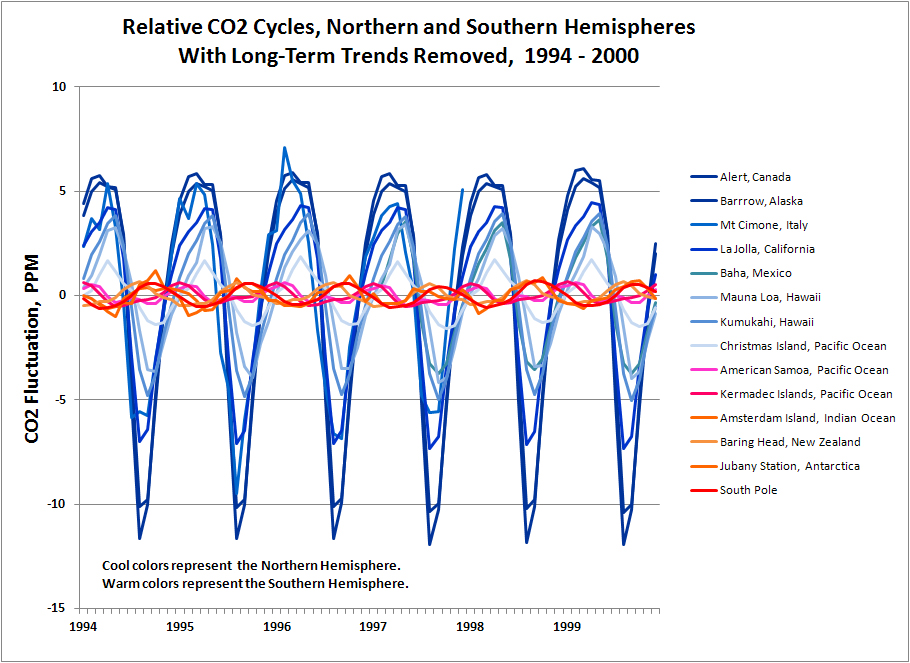
We can the long-term trends to study the cyclicity more closely.   I first subtracted the exponential function, and I then removed residual fluctuation (reflecting temporary events, such as the volcanic eruption of Mt. Pinatubo) by subtracting a 12-month moving average from the monthly data.
The resulting cycles are asymmetric. Negative excursions are roughly double the magnitude of positive excursions.  Area under the curve has been normalized to zero, so this means that negative deflections are brief, compared to positive deflections.  It is also easy to note that the cycle from the South Pole has an opposite polarity to the most of the other cycles.
This chart presents the normalized cycles by latitude.  The horizontal scale is time; CO2 seasonal cycles are displayed at the appropriate latitude of the monitoring station which recorded the data.   
A clear distinction can be seen.  Cycles in the Northern Hemisphere are high amplitude, while those in the Southern Hemisphere are low amplitude.

Here is a closer look at cycles by latitude.   The following chart expands the horizontal scale, showing only seven years of data.
As noted previously, polarity of the southernmost cycles (south of - 30 latitude) is reversed with respect to the Northern Hemisphere, but with much lower amplitude. 
If we take readings in the southern hemisphere as the global baseline, it is clear that there are both positive and negative factors influencing the seasonal fluctuation in CO2 in the northern hemisphere.
Close examination shows that cycles in the low southern latitudes (markers) share the polarity of the Northern Hemisphere.  Also, the peak and trough of Northern Hemisphere cycles shifts slightly according to latitude, and the onset of seasons.  In the fall, it seems clear that the early onset of winter causes an earlier trough at higher latitudes.  But in the spring, it is not clear why high latitudes have an earlier peak than low latitudes.  Both features may relate to the timing of atmospheric mixing between the hemispheres.
The seasonality and asymmetry of the cycles is quite apparent.  In the Northern Hemisphere, CO2 falls 
sharply in the three months of summer, followed by an increase during the fall, winter and spring.  The increase is initially sharp, then more gradual.
Northern Hemisphere cycles by season.
Southern Hemisphere cycles by season.  The low amplitude is striking, relative to the Northern Hemisphere.  The polarity reversal at low latitudes is also apparent.
 The following chart is a plot of trough-to-peak amplitude by latitude. 
Carbon dioxide concentration reflects many factors: fossil fuel usage, the natural carbon cycle of the biosphere, the influence of agriculture and livestock, the dissolution of limestones on land, and precipitation of limestone in the ocean.   In this plot, the observed amplitude of CO2 fluctuation is shown by latitude.
The Northern Hemisphere contains about two-thirds of the world's land mass, and 90% of the world's populations, and a similar proportion of the world's agriculture.  The prominent seasonal cyclic source for CO2 would be fossil fuel use, and the prominent seasonal sinks would be land plant growth, particularly agriculture.  I hope to do the math or find the data, and compare the sources and sinks for CO2, and present the results in a new post. (By the way, the respiration of 7 billion human beings contributes about 950 million kg of excess CO2 to the atmosphere on a non-seasonal basis.  We can also conclude that this volume (plus agricultural wastage) is a summer seasonal CO2 sink, due to agriculture.  But there's probably a better way to get the number).   For the moment, let's compare the amplitude of CO2 cycles to the distribution of population.
The bulk of the world's population lives in the Northern Hemisphere. Here's the chart of population, superimposed on the chart of the amplitude of CO2 cycles.
As we have seen, seasonal factors are concentrated in the highest latitudes, whereas the bulk of the population lives in middle latitudes.  However, I suspect (as a director of an Alaskan electrical company) that seasonal fossil fuel usage is higher per capita in higher latitudes.  Also, the curvature of the earth results in a smaller volume of atmosphere for dispersion.  However, I do not have a chart for population density, or fuel usage by latitude.

Next, we should quantify the relationship between atmospheric carbon cycles, and annual cycles of emissions from fossil fuels.  However, to my surprise, there is no source with monthly data for global fossil fuel emissions.  Andres and others have published an study with hard data for 21 countries with the highest CO2 emissions, and extrapolated to the other countries with a Monte Carlo model.  Here is the result of their study on CO2 emissions.
The annual cycle of emissions matches the annual cycles of CO2 observed the northern hemisphere.   
Here is a similar chart for CO2 emissions from various sources in the United States.
We should ask whether the magnitude of CO2 emissions matches the magnitude of CO2 annual fluctuation.
It is a matter of simple math.   There are 3160 gigatonnes of CO2 in the atmosphere.  Estimates of annual CO2 emissions from fossil fuels range from 27 gigatonnes to 35 gigatonnes; about 1% of the total, if dispersed through the entire atmosphere, or currently about 3.8 ppm, out of 390 ppm.   This is less than the observed cycles.  However, at least 90% of emissions are delivered in the northern hemisphere, which would create an annual signal of 7.6 ppm.  And finally, fossil fuels are consumed with a peak in winter.  If we assume that 65% of annual emissions occur during 6 winter months of the year, the amplitude of cycles due to fossil fuel consumption would be about 10 ppm, approaching the amplitude of cycles seen in the middle latitudes of the Northern Hemisphere, including the United States.  Of course, fossil-fuel CO2 emissions are not the entire story.  The natural respiration of the biosphere must be added to the signal from fossil fuels.  But the cyclicity of fossil fuel emissions appears to be of the right magnitude and timing to account for much of the positive CO2 fluctuation during winter months.
This chart shows the cyclicity of European gas consumption.  

The last factor to consider as an influence on seasonal CO2 cycles is agriculture.  Like landmass and population, agriculture is concentrated in the northern hemisphere.  
Globally, 140 billion metric tonnes of biomass is generated from agriculture each year.   Assuming 50% moisture content, and 45% carbon content of dry biomass, and converting from weight of carbon to carbon dioxide, we can calculate that 115 gigatons of CO2 is removed from the atmosphere during every growing season. This is roughly 4 times the volume of CO2 generated annually from fossil fuels. This is equivalent to a northern hemisphere, seasonal fluctuation of 37 ppm, about 3 times the amplitude of the largest observed cycles.  If the given estimates are correct, agriculture is the dominant driver of CO2 cycles.  The only surprise is that the cycles are not larger.
------------------------
This article is the second post in a series about Global CO2 trends and seasonal cycles.  The final article consolidates and summarizes results of the previous posts.

1)  The Keeling Curve
2)  The Keeling Curve and Seasonal Carbon Cycles
3)   Seasonal Carbon Isotope Cycles
4)   Long-Term Trends in Atmospheric CO2


5)   Modeling Global CO2 Cycles

6)   The Keeling Curve Summary: Seasonal CO2 Cycles, and Global CO2 Distribution
http://dougrobbins.blogspot.com/2013/05/the-keeling-curve-seasonal-co2-cycles.html

----------------

All CO2 data in this article is credited to C. Keeling and other at the Scripps Institute of Oceanography, also Gaudry et al, Ciattaglia et al, Columbo and Santaguida, and Manning et al.  The data can be found on the Carbon Dioxide Information Analysis Center; http://cdiac.ornl.gov/trends/co2/
World Background Map for charts courtesy ESRI.
The Milankovitch chart can be found on ClimateDataInfo: http://www.climatedata.info/Forcing/Forcing/milankovitchcycles.html
Vostok Ice Core charts can be found at a variety of sites.  I created an overlay from the chart posted here:  http://10ksnookers.blogspot.com/2011/02/coming-ice-age.html
The population chart was prepared by "Radical Cartographer" Bill Rankin.  http://www.radicalcartography.net/
I used the version of the map posted here: http://www.geekosystem.com/world-population-latitude-longitude/
Andres, R.J. et al, 2011, Monthly, global emissions of carbon dioxide from fossil fuel consumption, Tellus B, 63B, 309-327.
Monthly CO2 emissions USA, from CDIAC. http://cdiac.ornl.gov/trends/emis_mon/graphics/graphics.html
Quarterly report on European Gas markets, EU commission, Market Observatory for Energy