This blog post is a summary of several previous articles
regarding atmospheric CO2. This post
consolidates and clarifies the previous posts.
Take a deep breath. If you are about as old as me, that breath
now contains about 25% more CO2 than your first breath when you were born, and
about 42% more CO2 than when George Washington was president. These
numbers are changing rapidly, and have changed since I wrote my first post on
this subject two years ago.
Abstract:
Atmospheric CO2 is rising globally, and has risen substantially in our
lifetimes. The CO2 content of the
atmosphere is now higher than at any time in human history. There is a seasonal cycle to CO2
concentration driven by growth and decay of plants in the Northern Hemisphere. The CO2 cycle shows a strong fluctuation in the Northern Hemisphere and a very
weak fluctuation of opposite polarity in the Southern Hemisphere. Carbon
isotopes show a similar global pattern of seasonal fluctuation and long-term
change.
A simple model can be constructed in an Excel spreadsheet using known
volumes of agricultural production and fossil fuel consumption. The model shows the global distribution of
CO2, showing seasonal fluctuation and long-term increase identical to observed
data. The important thing is that the
model was created using only data from human influences, although natural factors
clearly exist and clearly affect atmospheric CO2. The ease with which the model was generated,
and the absence of quantifiable alternatives, clearly indicate that changes
in atmospheric CO2 are primarily the result of human activities.
The Keeling Curve
The Keeling Curve is a set of CO2 measurements taken since
1958 on a mountaintop in Hawaii. The
measurements document seasonal CO2 change, and a long-term exponential rise in
atmospheric CO2 concentration. The
Keeling curve at Mauna Loa fluctuates by about five ppm, peaking in the spring
and reaching a minimum in the fall. This
week, the observatory announced that CO2 levels had exceeded 400 ppm for the
first time at Mauna Loa.

The Keeling Curve, as measured at Mauna Loa, has a seasonal
cycle. Atmospheric CO2 falls in the Northern Hemisphere summer, and rises
during the Northern Hemisphere winter. This is consistent with the
absorption of CO2 by plants during the summer growing season, and the return of
CO2 to the atmosphere through respiration or oxidation during the rest of the
year.

Atmospheric CO2 has been measured at monitoring stations around the globe for a little over fifty years.

There is
remarkable consistency of the long-term trend of CO2 across the globe, although
details of the cycles differ. The amplitude of the cycles varies dramatically by
hemisphere and latitude. The data on
this chart are color-coded according to the monitoring stations shown above.

CO2 concentrations are rising everywhere on earth. Superimposed on the rising curve is a cycle
of seasonal fluctuation. The fluctuation
is strongest in the high latitudes of the Northern Hemisphere, and is weak in
the Southern Hemisphere. The following chart shows the seasonal CO2 cycle by latitude, with the long-term trend removed.

Long-Term CO2
Trends
Rising CO2 levels in the atmosphere are consistent with the
volume of CO2 released by fossil fuels.
About 60%of the CO2 released by fossil fuels stays in the atmosphere;
the remaining 40% is absorbed by earth systems acting as carbon
reservoirs. Examples include vegetation,
the ocean, and precipitation of limestone.
We can compare the cumulative emissions to the observed change in
atmospheric CO2, as seen in the following chart.

CO2 concentration in the Southern Hemisphere lags the rising
concentration in the Northern Hemisphere. The following chart shows the long-term trend at each CO2 monitoring station, with the seasonal cycle removed.

The average CO2 concentration in the Southern Hemisphere lags the Northern Hemisphere by about 2.7 ppm. Looking at it another way, rising CO2 in the Southern Hemisphere lags the Northern Hemisphere by about 21 months.

The average CO2 concentration in the Southern Hemisphere lags the Northern Hemisphere by about 2.7 ppm. Looking at it another way, rising CO2 in the Southern Hemisphere lags the Northern Hemisphere by about 21 months.

If we allocate fossil fuel emissions to each hemisphere by
GDP, we see that 83% of CO2 emissions occur in the Northern Hemisphere. Further, the 2.7 ppm difference in CO
concentration between the hemispheres is a very close match to the annual
excess CO2 emissions in the Northern Hemisphere. The 21-month lag in the average CO2 level of
the Southern Hemisphere represents the time required for atmospheric mixing of
CO2 emitted in the Northern Hemisphere.
Pre-historic concentrations of CO2 are best known from air
bubbles trapped in Antarctic ice. Ice-cores
have been recovered by drilling through the ice sheet. The core was carefully dated by counting
annual layers; by comparison with the deep-sea isotopic record; and by modeling
the rate of ice accumulation. Thousands
of feet of core provide a continuous record going back 400,000 years. Bubbles trapped in the ice are samples of
the ancient atmosphere. There is a
small uncertainty regarding the time when the bubbles became permanently
sealed, resulting in uncertainty of a few percent in the age of the trapped
samples. Current levels of atmospheric
CO2, measured anywhere in the world, substantially exceed any sample recorded
in ice cores for the past 400,000 to 800,000 years.

Pre-industrial levels of CO2 are estimated at about 280 ppm,
based on ice-core data and a number of
19th century chemical analyses.
An exponential function can be fitted to the data, beginning with 281
ppm CO2 in the year 1800, and fitting the modern data of the Keeling curve. Atmospheric CO2 is growing exponentially for
the simple reason that human population and the use of fossil fuels are growing
exponentially. The exponential growth of
fossil fuels use was well documented by geologist M. King Hubbert in his
classic paper on peak oil, gas, and coal, published in 1955.

The exponential function allows prediction of future levels
of atmospheric CO2. A global average of
400 ppm (seen at Mauna Loa this month) is expected to be reached in 2015. According to the forecast, 450 ppm will be
reached in the year 2031, and 500 ppm in the year 2042.

The Seasonal CO2
Cycle
We see some interesting features when we look at the seasonal cycle closely. Northern Hemisphere cycles are high amplitude, while the Southern Hemisphere is very low amplitude. The expected polarity reversal only occurs in high Southern latitudes (near the pole). Readings from latitudes less than 30 degrees south (near the equator; Kermadec Islands and American Samoa) share the polarity of the Northern Hemisphere.

We see some interesting features when we look at the seasonal cycle closely. Northern Hemisphere cycles are high amplitude, while the Southern Hemisphere is very low amplitude. The expected polarity reversal only occurs in high Southern latitudes (near the pole). Readings from latitudes less than 30 degrees south (near the equator; Kermadec Islands and American Samoa) share the polarity of the Northern Hemisphere.

The seasonal cycle has an amplitude of 17 ppm at high
latitudes in the Northern Hemisphere, and diminishes toward the equator. Amplitude of the cycle in the entire southern
hemisphere is much lower, about 1 to 2 ppm. The following chart shows the seasonal CO2 cycle with the long-term trend removed.
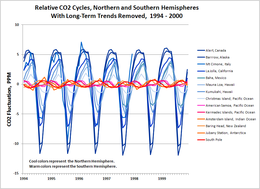
The amplitude of the CO2 cycle at high latitudes has increased since 1975 by about 3 ppm, from about 14 ppm to about 17 ppm. The increasing magnitude of the seasonal cycle probably represents increasing human agricultural activity, as human population increased from about 3.5 billion in 1970, to over 7 billion today.
 Global cyclicity is dominated by seasons in the Northern
Hemisphere. Polarity of the cycle in low
latitudes (near the equator) of the Southern Hemisphere follows the seasonal
patterns of the Northern Hemisphere.
Polarity of the seasonal cycle is reversed near the pole in the Southern
Hemisphere.
Global cyclicity is dominated by seasons in the Northern
Hemisphere. Polarity of the cycle in low
latitudes (near the equator) of the Southern Hemisphere follows the seasonal
patterns of the Northern Hemisphere.
Polarity of the seasonal cycle is reversed near the pole in the Southern
Hemisphere.


The seasonality and asymmetry of the cycles is quite
apparent. In the Northern Hemisphere,
CO2 falls sharply in the three months of summer, followed by an increase during
the fall, winter and spring. The
increase is initially sharp in the fall, then more gradual through winter and spring.

Southern hemisphere cycles are low amplitude and symmetrical. Polarity of the cycles at low latitudes (near the equator) follows the polarity of the Northern Hemisphere.

The obvious question is what drives seasonal CO2 cycles, and why the Northern Hemisphere is dramatically different than the Southern Hemisphere. The Northern Hemisphere contains only two-thirds of the earths landmass, but 88% of the human population, and produces 83% of the worlds GDP. We will explore these factors by modeling the CO2 cycle, considering both fossil fuel consumption and the photosynthesis/oxidation cycle, but first we should look at changes in carbon isotopes in the atmosphere.
Seasonal Carbon
Isotope Cycles
Carbon mostly occurs in two naturally occurring isotopes:
C12 and C13. C12 comprises about 99
percent of carbon in the world, while C13 comprises most of the other percent.*
The
light isotope, C12, is more easily taken up in plants during photosynthesis.
Coal and oil, which are derived from wood and algae, are enriched lighter isotopes. The light isotope is also more easily
metabolized by bacteria, which produce natural gas. CO2 produced by burning fossil fuel
reflects the carbon composition of the fuel, and is isotopically lighter than
CO2 in the atmosphere.
The
ratio of C13 to C12 is expressed as a standard measure: dC13/C12 (usually pronounced "del-thirteen").
The measure represents the ratio of C13 to C12, as compared to a standard
ratio, in tenths of a percent. The
isotopic record for CO2 since 1970 shows a steadily declining value of dC13/C12, showing progressively lighter isotopic CO2 in the
atmosphere.

 This long-term observed trend
of isotopically lighter CO2 is consistent with an increasing contribution of
fossil fuels to atmospheric CO2. A
simple calculation combining the isotopic composition of fossil fuels and the
atmosphere would predict an even larger decline in atmospheric dC13/C12. The modest
decline observed in the data shows involvement of other carbon sinks in the
environment, exchanging carbon with the atmosphere and moderating the dC13/C12 decline in the atmosphere.
This long-term observed trend
of isotopically lighter CO2 is consistent with an increasing contribution of
fossil fuels to atmospheric CO2. A
simple calculation combining the isotopic composition of fossil fuels and the
atmosphere would predict an even larger decline in atmospheric dC13/C12. The modest
decline observed in the data shows involvement of other carbon sinks in the
environment, exchanging carbon with the atmosphere and moderating the dC13/C12 decline in the atmosphere.

Carbon
isotopes show a seasonal fluctuation very similar to the CO2 seasonal
cycle. Strong seasonal fluctuation is
observed in the Northern Hemisphere, and weak seasonal fluctuation in the
Southern Hemisphere.

The Northern Hemisphere, with much greater fertile land area than the Southern Hemisphere, removes a significant volume of light carbon from the atmosphere during the growing season. The isotope cycle shows an asymmetry similar to the asymmetry of the CO2 cycle. The isotopic composition of the atmosphere in the Northern Hemisphere rises sharply in the summer, and then declines gradually as a result of atmospheric mixing and oxidation of the biomass following the growing season.


The Northern Hemisphere, with much greater fertile land area than the Southern Hemisphere, removes a significant volume of light carbon from the atmosphere during the growing season. The isotope cycle shows an asymmetry similar to the asymmetry of the CO2 cycle. The isotopic composition of the atmosphere in the Northern Hemisphere rises sharply in the summer, and then declines gradually as a result of atmospheric mixing and oxidation of the biomass following the growing season.

Additional modeling of the carbon isotope data would be valuable. We can make a back-of-the-envelope calculation of the expected change in atmospheric dC13/C12 based on fossil fuel combustion. The calculation shows a larger expected change than observed in the atmosphere. We know that atmospheric CO2 is moderated by the action of various carbon sinks, which exchange carbon with the atmosphere. Assuming an average fossil fuel dC13/C12 of -25, and the atmospheric dC13/C12 of -7.5 (1977), would suggest a decrease in atmospheric dC13/C12 to -9.5, a change of -2.0. The actual decrease observed is only to -8.2, a change of -0.7. This suggests that the volume of the total carbon reservoir actively exchanging carbon with the atmosphere is about twice the size of the total carbon in the atmosphere. A more detailed model would provide greater confidence in this conclusion.
*C14, an unstable radioactive isotope, occurs in trace amounts in nature. The radioactive isotope is important for age-dating anything containing carbon, within about 10 half-lives of the isotope, or about 60,000 years before present. C14 was also produced by nuclear weapons but has been rapidly decreasing in the environment since the cessation of above-ground nuclear testing.
Modeling Atmospheric CO2
*C14, an unstable radioactive isotope, occurs in trace amounts in nature. The radioactive isotope is important for age-dating anything containing carbon, within about 10 half-lives of the isotope, or about 60,000 years before present. C14 was also produced by nuclear weapons but has been rapidly decreasing in the environment since the cessation of above-ground nuclear testing.
Modeling Atmospheric CO2
A
simple but quantitative model can be constructed to show the global distribution
of atmospheric CO2, using an Excel spreadsheet.
Inputs to the model include
agricultural biomass, fossil fuel emissions, absorption of excess CO2 by carbon
sinks, and atmospheric mixing between the Northern and Southern Hemispheres. The final model begins in the
year 1971, and yields a set of CO2 curves by latitude that closely matches
the actual record.


Model
inputs include known quantities of fossil-fuel consumption over several decades
and known volumes of agricultural biomass.
The model allocates fossil fuel emissions and agriculture by hemisphere
(N & S), and applies a simple mixing model to yield CO2 concentration
at five latitude positions on the earth.
The annual oxidation of agricultural biomass is inferred and modeled to
fit observations of the CO2 cycle.
The CO2 seasonal cycle is dominated by the Northern Hemisphere, representing 67% of the earth's landmass, 90% of the human population (agriculture), and 83% of the industrial activity (GDP). Modeling the cycle required consideration of fossil fuels and the photosynthesis/oxidation cycle.
Upon seeing the seasonal CO2 cycle in the Northern Hemisphere, my initial thought was that seasonal burning of fossil fuels accounted for much of the fluctuation. Monthly consumption of oil, coal, and natural gas does show a seasonal fluctuation, with the correct polarity for the observed CO2 cycle. However, fossil fuel consumption in the Northern Hemisphere produces only a 0.5 ppm seasonal cycle in atmospheric CO2, as compared to the 17 ppm cycle observed in actual data. The following chart of seasonal CO2 emissions (with long-term growth of CO2 removed) was calculated from 2009-10 data from EIA and the BP Statistical Review of World Energy.
From earlier observations, the model was constructed using the following parameters:
- CO2 taken up by Plants during the growing season
- Oxidation of carbon in plants following the growing season
- CO2 emissions from Fossil Fuels
- Absorption of CO2 by carbon sinks (e.g. oceans)
- Exchange of CO2 between Northern and Southern Hemispheres.
The CO2 seasonal cycle is dominated by the Northern Hemisphere, representing 67% of the earth's landmass, 90% of the human population (agriculture), and 83% of the industrial activity (GDP). Modeling the cycle required consideration of fossil fuels and the photosynthesis/oxidation cycle.
Upon seeing the seasonal CO2 cycle in the Northern Hemisphere, my initial thought was that seasonal burning of fossil fuels accounted for much of the fluctuation. Monthly consumption of oil, coal, and natural gas does show a seasonal fluctuation, with the correct polarity for the observed CO2 cycle. However, fossil fuel consumption in the Northern Hemisphere produces only a 0.5 ppm seasonal cycle in atmospheric CO2, as compared to the 17 ppm cycle observed in actual data. The following chart of seasonal CO2 emissions (with long-term growth of CO2 removed) was calculated from 2009-10 data from EIA and the BP Statistical Review of World Energy.


The model for seasonal CO2 uptake through photosynthesis was constructed beginning with the volume of biomass generated through agriculture. Agriculture generates about 140 gigatonnes of biomass every year.
http://www.unep.or.jp/Ietc/Publications/spc/WasteAgriculturalBiomassEST_Compendium.pdf
After adjustments for the portion in the Northern Hemisphere (83%), moisture content (50%), carbon content (45%), and conversion to CO2 (3.67x) we can calculate about 96 gigatonnes of CO2 removed from the Northern Hemisphere atmosphere during the summer growing season. Thus, during the growing season, CO2 in the Northern Hemisphere falls sharply.
The model distributed agricultural carbon and fossil fuel use according to economic output by hemisphere. The Northern Hemisphere represents 83% of global economic output, and the Southern Hemisphere represents 17% of global economic output.
The following chart shows the monthly scheduling of photosynthesis, oxidation and fossil fuel consumption in the model for the Northern Hemisphere.


In modeling the Southern Hemisphere, I found that 17% of global agricultural biomass produced CO2 fluctuations that were far too large to match the data in the Southern Hemisphere. I found a good match by using only 5% of global agricultural biomass. The chart below shows the model parameters.

Here is the modeled match to high-latitude Southern Hemisphere CO2, using 5% of global agricultural biomass. It seems likely to me that the Southern Hemisphere photosynthesis/oxidation cycle is overwhelmed by CO2 mixing from the Northern Hemisphere, thus requiring a smaller volume to match the data.


The photosynthetic model, which was developed for the year 2009, was adjusted for earlier years as a function of global population. This resulted in cycles with increasing amplitude through the range of the model. Agricultural production was assumed to vary directly as a function of population, but incremental agriculture was assumed to displace natural vegetation. Growth of CO2 intake through photosynthesis was increased at a rate of 50% of incremental agricultural output (back-calculated from the 2009 model).
Although the fossil fuel input is much too small to account for the seasonal fluctuation in CO2, the long term effect is significant. Carbon dioxide from fossil fuel emissions was added according to estimates from IEA and the BP statistical review of world energy. Annual figures in these reports were scheduled on a monthly basis by analogy to US monthly consumption of coal, natural gas, and oil. The volume of fossil fuel CO2 emissions was reduced by 40% to reflect the volume of CO2 absorbed by carbon sinks.
As previously noted, rising CO2 in the Southern Hemisphere lags CO2 in the Northern Hemisphere by a period of about 22 months. The model was constructed to transfer half of the fossil fuel CO2 of the Northern Hemisphere to the Southern Hemisphere, using a lag of 22 months to represent the necessary mixing time.

Despite the general simplicity of the model, the resulting CO2 curve shows a reasonable correlation to actual data recorded across the global range of latitudes, and after 38 years of CO2 addition and subtraction, the model concludes at the appropriate concentrations of CO2 across the globe.
The most important conclusion from modeling global CO2 is that both long-term and seasonal change in atmospheric CO2 can be easily modeled using only inputs from human activities.
Other conclusions are as follows:
2) Surprisingly, fossil fuel use does not have a significant effect on seasonal CO2 cycles. Known volumes and timing of fossil-fuel emissions do not match the cyclicity in CO2 observations.
3) Photosynthesis in the Northern Hemisphere dominates the seasonal CO2 cycle. The model produced a good match to Northern Hemisphere seasonal CO2 using only agricultural biomass. However, it is understood that natural biomass is also significant. The agricultural volume is a proxy for the net volume of CO2 taken up and released by vegetation, in a more complex system.
4) Oxidation of vegetation occurs quickly. Three quarters of the net seasonal biomass is oxidized in the first three months following the growing season. Specifics on how and where this oxidation occurs would add confidence to the model. Falling leaves and burning agricultural waste may account for some of the rapid oxidation following the growing season.
5) The Northern Hemisphere dominates both seasonal and long-term trends in atmospheric CO2. Global CO2 data and the model provide evidence for atmospheric mixing, to explain the 1) varying amplitude of seasonal CO2 cycles by latitude, 2) the lag of rising CO2 in the Southern Hemisphere, and 3) the gradation in phase of the cycles observed at intermediate latitudes. The evidence of the degree and timing of atmospheric mixing may be useful in other areas of climate research.
6) Calculations comparing isotope changes from fossil fuel emissions to the observed carbon isotope record suggest that the total reservoir of environmental carbon (including the atmosphere) is about three times the volume of carbon in the atmosphere.
------------
This post is a summary of previous posts about atmospheric CO2. Additional details about the work can be found in these posts.
References:
Monthly data for US fossil fuel consumption were taken from the EIA website:
Global population figures from 1970 - 2010 were taken from Wikipedia.
The estimate for annual global biomass, circa 2009 was taken from a UN report:
http://www.unep.or.jp/Ietc/Publications/spc/WasteAgriculturalBiomassEST_Compendium.pdf
6) Calculations comparing isotope changes from fossil fuel emissions to the observed carbon isotope record suggest that the total reservoir of environmental carbon (including the atmosphere) is about three times the volume of carbon in the atmosphere.
------------
This post is a summary of previous posts about atmospheric CO2. Additional details about the work can be found in these posts.
1) The Keeling Curve
2) The Keeling Curve and Seasonal Carbon Cycles
4) Long-Term Trends in Atmospheric CO2
5) Modeling Global CO2 Cycles
References:
Global CO2 concentration data in this report is credited to C.
Keeling and others at the Scripps Institute of Oceanography, also Gaudry et al, Ciattaglia
et al, Columbo and Santaguida, and Manning et al. The data can be found
on the Carbon Dioxide Information Analysis Center.
Data for CO2 released by fossil fuels is available from
EIA CO2 Emissions from Fuel Consumption,
http://www.iea.org/co2highlights/co2highlights.pdf
And the BP Statistical Review of World Energy:
http://www.bp.com/sectionbodycopy.do?categoryId=7500&contentId=7068481
http://www.iea.org/co2highlights/co2highlights.pdf
And the BP Statistical Review of World Energy:
http://www.bp.com/sectionbodycopy.do?categoryId=7500&contentId=7068481
Monthly data for US fossil fuel consumption were taken from the EIA website:
Global population figures from 1970 - 2010 were taken from Wikipedia.
The estimate for annual global biomass, circa 2009 was taken from a UN report:
http://www.unep.or.jp/Ietc/Publications/spc/WasteAgriculturalBiomassEST_Compendium.pdf


.jpg)